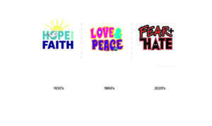
This is a series I call illustrative logos. Back in the 70’s and 80’s and even 90s logos needed to be simple, for reproduction purposes. Simple, one color, logos were the standard for 4 color printing. Logos came in two versions, a PMS color, and a black and white. But let’s consider the use. Today, with web graphics as a marketing standard, along with digital printing, the need for a one color insignia is now passe. Sure, for a corporate look we want to see what everyone else is displaying, like sheep we follow the leader. We need to compete. Simple is the gold standard. I say, you want simple, use type. Put type into a rectangle and call it dome. Better, an icon for a stiff, unapproachable look of the past.
If you think of Google, Microsoft and other giants, they have been using multi-colored logos for years.
Not all companies are corporate. There is an ongoing family business boom. As the baby boomers age they are leaving the corporate world. Some are starting businesses from long lost dreams, or out of financial need. Let’s get to the heart of commerce with more joy, more color, more expression, and more innovation.
As the desire for local and home grown goods grows, so must the art. The medallion series came out of the desire for a more illustrative approach to logos.